
Stencil and Storybook – How to generate argTypes from JSDoc comments
»Web Components«
Stencil, Storybook, Web Components, Custom Elements Manifest, JSDoc, argTypes, TypeScript
When using Stencil with Storybook, you’ll quickly notice that Controls don’t work out of the box. This guide shows you how to automatically generate proper argTypes from your JSDoc comments using the Custom Elements Manifest.
The Problem
Storybook for Web Components relies on the Custom Elements Manifest to generate the props/attributes table below your default story from your JSDoc blocks. Even when using correct TypeScript types and JSDoc comments, these don’t automatically translate into proper Storybook Controls without some additional setup.
You’ll end up with “Set object” buttons instead of proper select, radio, or boolean controls to play with your components attributes in Storybook.
Let’s tackle this problem step by step.
1. Generating a Custom Elements Manifest
The Custom Elements Manifest is a JSON file containing metadata about your web components – their properties, attributes, events, and methods. Storybook uses this metadata to automatically generate documentation and controls.
First, install the Custom Elements Manifest Analyzer:
npm install --save-dev @custom-elements-manifest/analyzer
Create a custom-elements-manifest.config.js in your project root:
export default {
  globs: ['src/components/**/*.tsx'],
  outdir: '.',
  exclude: ['**/*.spec.tsx', '**/*.e2e.tsx', '**/*.stories.tsx'],
  dev: false,
  litelement: false,
  catalyst: false,
  stencil: true,
};
Add a script to your package.json:
{
  "scripts": {
    "analyze": "custom-elements-manifest analyze",
    "prebuild": "npm run analyze",
    "build": "stencil build",
    "prestorybook": "npm run build",
    "storybook": "storybook dev -p 6006",
    "prebuild-storybook": "npm run build",
    "build-storybook": "storybook build"
  }
}
The prebuild script ensures the manifest is regenerated before each Stencil build. The prestorybook and prebuild-storybook scripts run the full build (which includes generating the manifest via prebuild) to ensure both the components and the manifest are up-to-date before starting or building Storybook.
Important: Add custom-elements.json to your .gitignore since it’s a generated file.
2. Enriching the Manifest with Type Information
Stencil sometimes omits type information for boolean props in the generated manifest. We need a plugin to fix this:
Create stencil-manifest-plugin.js:
/**
 * Custom Elements Manifest Plugin for Stencil components
 *
 * This plugin enriches the custom-elements.json generated by Stencil with
 * missing type information and removes internal implementation details.
 *
 * Functions:
 * 1. Type Enrichment: Transfers type information from @Prop() members to their
 *    corresponding HTML attributes. This is necessary because Stencil sometimes
 *    omits type information in attributes for boolean props.
 *
 * 2. Member Filtering: Removes internal @State() and other non-public members
 *    from the manifest, keeping only @Prop() declarations with corresponding
 *    HTML attributes.
 *
 * Used by: Storybook for automatic Control generation
 */
export const stencilEnrichAttributeTypes = {
  name: 'stencil-enrich-attribute-types',
  moduleLinkPhase({ moduleDoc }) {
    moduleDoc?.declarations?.forEach(declaration => {
      if (declaration.members && declaration.attributes) {
        // Create a map from fieldName to member for type lookup
        const memberMap = new Map();
        declaration.members.forEach(member => {
          if (member.name) {
            memberMap.set(member.name, member);
          }
        });

        // Add missing type information to attributes
        declaration.attributes.forEach(attr => {
          if (attr.fieldName && !attr.type) {
            const member = memberMap.get(attr.fieldName);
            if (member?.type) {
              attr.type = member.type;
            }
          }
        });
      }

      // Filter out @State() and other internal members
      if (declaration.members) {
        declaration.members = declaration.members.filter(member => {
          // Keep only @Prop() members (those have an attribute)
          return member.kind === 'field' && member.attribute;
        });
      }
    });
  },
};
Update your custom-elements-manifest.config.js:
import { stencilEnrichAttributeTypes } from './stencil-manifest-plugin.js';

export default {
  globs: ['src/components/**/*.tsx'],
  outdir: '.',
  exclude: ['**/*.spec.tsx', '**/*.e2e.tsx', '**/*.stories.tsx'],
  dev: false,
  litelement: false,
  catalyst: false,
  stencil: true,
  plugins: [stencilEnrichAttributeTypes],
};
3. Configuring Storybook
Storybook’s .storybook/preview.js file is the central configuration for customizing how stories are rendered and controlled. There are several ways to adapt preview rendering – using decorators, loaders, or enhancers. For our use case, we’ll use argTypesEnhancers, which allows us to programmatically generate argTypes based on the Custom Elements Manifest.
Create .storybook/enhance-arg-types.js to handle the argTypes generation:
import customElements from '../custom-elements.json';

/**
 * Enhances argTypes for Storybook based on Custom Elements Manifest
 * Automatically generates proper controls for union types, booleans, numbers, etc.
 */
export function enhanceArgTypes(context) {
  const { component } = context;
  if (!component) return {};

  const componentDef = customElements?.modules
    ?.flatMap((m) => m.declarations || [])
    ?.find((d) => d.tagName === component);

  if (!componentDef) return {};

  const argTypes = {};

  // Attributes/Props
  componentDef.attributes?.forEach((attr) => {
    const name = attr.name;

    argTypes[name] = {
      description: attr.description,
      table: {
        defaultValue: { summary: attr.default?.replace(/'/g, '') },
        category: 'attributes',
      },
    };

    if (attr.type?.text) {
      const text = attr.type.text;

      // Handle union types like 'info' | 'success' | 'error'
      if (text.includes('|')) {
        const options = text
          .split('|')
          .map(v => v.trim().replace(/['"]/g, ''));

        argTypes[name].control = {
          type: options.length <= 3 ? 'inline-radio' : 'select',
        };
        argTypes[name].options = options;
      } else if (text === 'boolean') {
        argTypes[name].control = { type: 'boolean' };
        argTypes[name].type = 'boolean';
      } else if (text === 'number') {
        argTypes[name].control = { type: 'number' };
      } else {
        argTypes[name].control = { type: 'text' };
      }
    }
  });

  // Events
  componentDef.events?.forEach((event) => {
    argTypes[event.name] = {
      description: event.description,
      table: {
        category: 'events',
        type: { summary: event.type?.text || 'CustomEvent' },
      },
      control: false,
    };
  });

  return argTypes;
}
Now update your .storybook/preview.js:
import { setCustomElementsManifest } from '@storybook/web-components';
import customElements from '../custom-elements.json';
import { defineCustomElements } from '../dist/loader';
import { enhanceArgTypes } from './enhance-arg-types.js';

setCustomElementsManifest(customElements);
defineCustomElements();

const preview = {
  parameters: {
    controls: {
      matchers: {
        color: /(background|color)$/i,
        date: /Date$/i,
      },
      hideNoControlsWarning: true,
    },
  },
  argTypesEnhancers: [enhanceArgTypes],
  tags: ['autodocs']
};

export default preview;
Writing Your Stories
With the global enhancer in place, your stories become much simpler by ommiting the argTypes and only providing the default args values:
import type { Meta, StoryObj } from '@storybook/web-components-vite';
import { html } from 'lit';

const meta: Meta = {
  title: 'Components/Alert',
  component: 'my-alert',
  tags: ['autodocs'],
};

export default meta;

export const Alert: StoryObj = {
  args: {
    variant: 'info',
    text: 'Here is the info text',
    'has-close-button': true,
  },
  render: (args) => html`
    <my-alert
      variant=${args.variant}
      ?has-close-button=${args['has-close-button']}
    >${args.text}</my-alert>
  `,
};
Important notes:
- Use kebab-case for attribute names in args (
'has-close-button'nothasCloseButton) - Use Lit’s boolean attribute syntax
?attribute-namefor boolean props - Slots can be added as regular args and rendered as children
Example Component
Here’s how to properly document your Stencil components:
import { Component, Host, h, Prop } from '@stencil/core';

/**
 * Component for an alert box.
 */
@Component({
  tag: 'my-alert',
  styleUrl: 'my-alert.scss',
  shadow: true,
})
export class MyAlert {
  /**
   * Variant of the alert.
   * @type {'info' | 'success' | 'error' | 'warning'}
   * @default 'info'
   */
  @Prop() variant: 'info' | 'success' | 'error' | 'warning' = 'info';

  /**
   * Whether the close button should be displayed.
   * @type boolean
   * @default true
   */
  @Prop() hasCloseButton = true;

  render() {
    return (
      <Host>
        <div class={`alert alert-${this.variant}`}>
          <slot />
          {this.hasCloseButton && (
            <button type="button">
              <i class="fa fa-close" />
            </button>
          )}
        </div>
      </Host>
    );
  }
}
The JSDoc comments are essential for proper documentation:
-
@typedefines the type (will be parsed for union types) -
@defaultshows the default value in Storybook - Description appears in the Controls panel
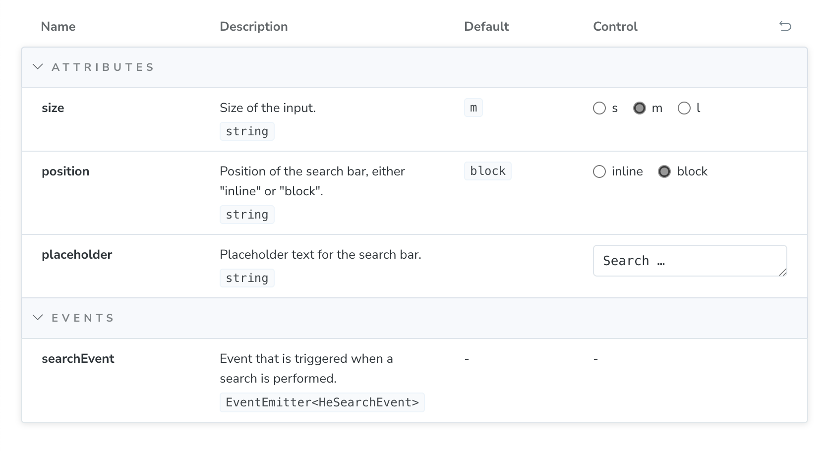
Result
With this setup, Storybook will automatically:
- Generate radio buttons or select dropdowns for union types
- Create boolean toggles for boolean props
- Display text inputs for strings
- Show number inputs for numbers
- List events in the events category
No manual argTypes configuration needed in your stories!
Additional Resources
Related posts
- How to flash ESP8266 (and ESP32) to use Espruino firmware on macOS
- Helpers and tips for npm run scripts
- JSConf Budapest 2017 – A personal recap
Comments
Comments are removed for now. Feel free to contact me via Twitter in case you’d like to talk about this blog post: @mkuehnel.